Welcome to art 4/23/2012
Assign seats and jobs
Distribute materials
Go over syllabus and classroom expectations
Set up tables and bins
Distribute materials
Go over syllabus and classroom expectations
Set up tables and bins
Do Now 4/24/2012:
What do you know about color?
Make the following colors by mixing the markers at your table:
Green
Orange
Violet
Vocabulary: Hue, Value, Intensity
Color is everywhere. In our clothes, the sky, trees, flowers, billboards designed to attract our attention, on the web and on television. There are literally thousands of colors; from bright to dull (intensity) and light to dark (value). Colors are powerful; they can make objects seem to glow, to come forward and recede, or to appear bigger or smaller. Colors can also be symbolic, with meanings that change from culture to culture. A color can symbolize an object or thing such as blue for water and green for grass and the leaves of trees or it may symbolize an emotion or idea, such as red for love, yellow for fear and blue for sadness. A trained artist is familiar with all of these options and can select and combine colors to create a desired impression or to evoke a certain mood.
How we see color:
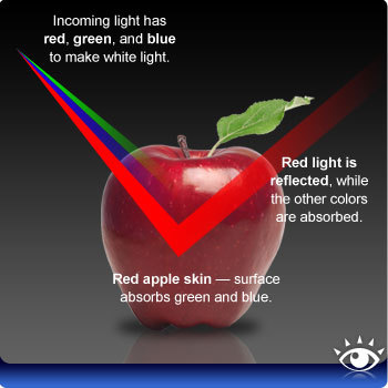
Color is a property of light. When we say an object is red, we mean that its surface absorbs certain wavelengths of light that we call red, we identify the object as red in color. If all wavelengths of light are absorbed, we identify the color as black, if all wavelengths of color are reflected, we see white.
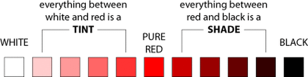
Color has 3 characteristics: hue, value and intensity.
•Hue is actually the color we see —such as red.
•Value refers to the lightness and darkness of a hue. For example, maroon is a dark value (shade) of red and pink is a light value (tint) of red.
•Intensity is the brightness or dullness of a color.
Agenda: Color Mixing
Step 1:
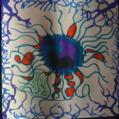
On a square piece of blending paper, create a design of your choice. Consider color: what colors will combine to create other colors? When you fill the paper, place colors that will mix well next to one another. Fill the entire paper leaving minimal white space.
Step 2:
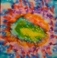
Paint your drawing with water and watch the colors bleed together and mix to make new colors. You can sprinkle with salt to create white spots.
Do Now 4/25/2012:
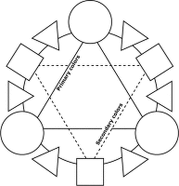
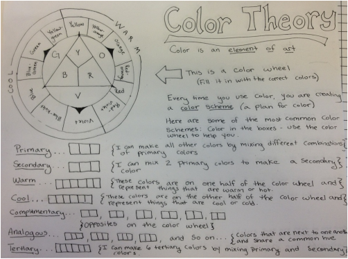
A color wheel is a tool that artists use to understand colors. Draw the following image of a color wheel into your sketchbook.
If you can fill in the primary and secondary colors, do so with the markers at your table.
Vocabulary:
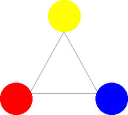
Primary Colors
Secondary Colors
Tertiary Colors
Primary Colors
Secondary Colors
Tertiary Colors
Primary Colors: Red, Yellow and Blue and are used to create the rest of the colors on the color wheel.
Fill these colors in on your color wheel.
Secondary colors are made by mixing two primary colors. These colors are Orange (yellow and red), Green (blue and yellow) and violet (red and blue)
Fill these colors in on your color wheel
Tertiary colors are made by mixing one primary color and one secondary color.
Fill these colors in on your color wheel and label them:
- yellow-orange
-red-orange
-red-violet
-blue-violet
-blue-green
-yellow-green
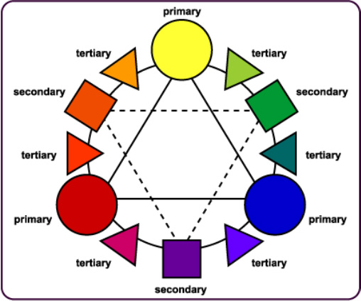
The color wheel.
Agenda: Symbol Design and Composition
Step 3:
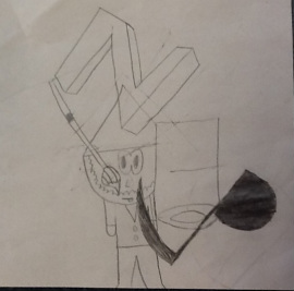
Create a symbol to represent you. Use the letters of your name combined with images that describe things about you and things that you like. Fill the paper.
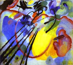
Do Now 4/26/2012:
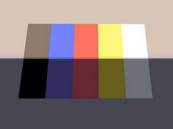
-What colors did the artist use in the artwork?
-Are those colors primary, secondary, or tertiary colors?
-Draw a simple version of the artwork.
|
Vocabulary: Craftsmanship and Composition
•Craftsmanship: skill or ability to make sure a project is done well
•Composition: The plan, placement, or arrangement of the elements of parts of an artwork
Wassily Kandinsky. Improvisation 26 (Oars). 1912. Oil on canvas. 97 x 107.5 cm. Städtische Galerie im Lenbachhaus, Munich, Germany.
•Composition: The plan, placement, or arrangement of the elements of parts of an artwork
Wassily Kandinsky. Improvisation 26 (Oars). 1912. Oil on canvas. 97 x 107.5 cm. Städtische Galerie im Lenbachhaus, Munich, Germany.
Step 4:
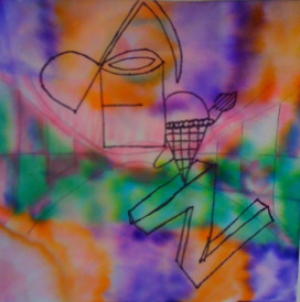
Consider the composition of the color on your paper when you draw the design into your artwork. Outline in black permanent marker.
Glue your design to the front of your sketchbook. Give it a title.
Glue your design to the front of your sketchbook. Give it a title.
If you finish early: Complete the color theory worksheet
Complete both front and back for full credit (classwork grade)
Do Now: 4/27/2012
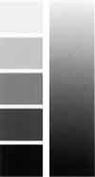
Make a value scale in your sketchbook
Vocabulary:
Tint
Tone
Shade
Vocabulary:
Tint
Tone
Shade
Tint:
Tone:
Shade: Color + Black